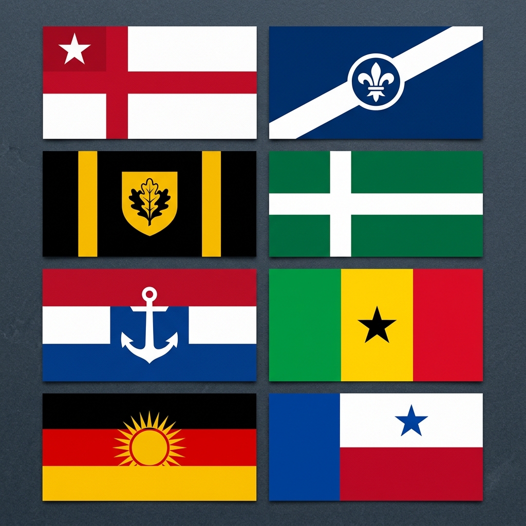
Flag Color Combinations That Work | Design Guide
Why flag colors are different from regular design colors
In logo or web design, you have full control over viewing conditions. A flag is different: it needs to work printed on fabric, photographed in sunlight, seen at 100 metres, and reproduced by a child with four crayons.
That constraint makes color choice critical. The colors that work in flags are not the same as the colors that work in digital design.
Three rules govern flag color:
1. Flat, not gradient. Fabric can't reproduce gradients. Every flag is made from solid panels of color — so your combinations need to work in flat form.
2. Rule of tincture. Never place a dark color directly against another dark color. The two flag "families" are metals (gold/yellow, silver/white) and colors (everything else). Always separate colors with a metal, or a metal with colors. Breaking this rule produces illegible, flat-looking flags.
3. Distance legibility. At 50 metres, fine detail disappears. High contrast between background and foreground is more important than aesthetic harmony.
Try any combination instantly
→ AI Flag Generator — describe your color scheme and get a proportioned, editable design in seconds.
→ Canvas Editor — build from scratch with full color control.
→ Random Flag Generator — generates rule-of-tincture-compliant random combinations with lock/unlock controls.
The 12 best flag color combinations (with real examples)
Two-color combinations
1. Red + White The most common flag combination in the world. Japan, Denmark, Switzerland, Canada, England.
- Why it works: maximum contrast, reads instantly at any distance
- Mood: bold, urgent, clean
- Best layout: solid red with white emblem, or horizontal/vertical split
2. Blue + White Greece, Scotland, Finland, Israel, Argentina.
- Why it works: calm contrast, sky-and-cloud association across cultures
- Mood: coastal, civic, peaceful
- Best layout: horizontal stripes or white cross on blue
3. Black + Yellow/Gold Germany, Belgium, Jamaica.
- Why it works: Black and yellow have the highest natural contrast of any color pair
- Mood: strong, definitive, industrial
- Best layout: horizontal or diagonal stripes; avoid complex emblems
4. Green + White Nigeria, Pakistan, Saudi Arabia (with Arabic text).
- Why it works: clean, fresh, culturally resonant in Islamic and pan-African contexts
- Mood: nature, hope, faith
- Best layout: vertical split or wide horizontal stripe
5. Red + Black Albania (with gold), Angola, Kenya (with white).
- Why it works: dramatic contrast — but needs a metal separator (gold or white) to satisfy the rule of tincture
- Mood: power, revolution, strength
- Best layout: always add white or gold outline between red and black areas
Three-color combinations
6. Red + White + Blue United States, United Kingdom, France, Netherlands, Russia, Australia, New Zealand.
- Why it works: extremely high combined contrast; reads well at all distances
- Mood: western civic tradition, naval heritage
- Best layout: horizontal tricolor (France), vertical with canton (US), or union cross (UK)
- Caution: extremely common — your design needs a distinctive layout or emblem to differentiate
7. Green + Yellow + Red Pan-African tricolor used by Ethiopia, Ghana, Guinea, Senegal and many others.
- Why it works: warm, saturated, vibrant combination; strong cultural identity
- Mood: African solidarity, tropical, optimistic
- Best layout: horizontal tricolor (standard); central star for Pan-African flag
8. Black + Red + Gold Germany. Also used in the Belgian flag (black, yellow, red).
- Why it works: extremely high contrast; immediately recognizable
- Mood: authoritative, powerful, definitive
- Best layout: horizontal tricolor (Germany's standard)
9. Blue + Yellow + Red Colombia, Ecuador, Venezuela share this tricolor (Colombia's version is most-recognized).
- Why it works: high contrast across all three; warm-cool balance
- Mood: vibrant, South American civic tradition
- Best layout: horizontal bands with varying widths
10. Red + White + Green Italy, Hungary, Bulgaria (different stripe orders), Iran (with gold emblem).
- Why it works: botanical, warm, nationally resonant across multiple cultures
- Mood: agricultural, Mediterranean, traditional
- Best layout: vertical tricolor (Italy); avoid complex emblems on green
11. Blue + White + Red (different arrangement) Iceland: blue background, red cross outlined in white.
- Why it works: Nordic cross format maximizes all three colors; white separation satisfies tincture rule
- Mood: Nordic, historic, clean
- Best layout: Nordic cross only (the cross format is distinctive in itself)
12. Black + White + Red Qatar, Bahrain (with white serrated divider), Yemen.
- Why it works: neutral black and white frame a vivid red — strong contrast trio
- Mood: stark, modern, strong
- Best layout: vertical split or serrated divider
The colors to avoid (and why)
| Color pair | Problem | Fix | |---|---|---| | Red + Green | Color-blind illegible (affects 8% of men) | Add white separator | | Purple + Black | Near-zero contrast at distance | Replace purple with blue | | Orange + Red | Too similar in value | Add white or yellow between them | | Brown + any color | Brown doesn't read as bold at distance | Replace with black or deep red | | Pastel + pastel | Too low contrast; washed out in sunlight | Use saturated colors only |
Color meaning quick reference
| Color | What it signals on flags | |---|---| | Red | Sacrifice, courage, revolution, blood | | Blue | Ocean, sky, freedom, loyalty | | Green | Agriculture, Islam, hope, nature | | Black | Power, strength, determination | | White | Peace, purity, unity | | Gold/Yellow | Wealth, sun, generosity, prosperity | | Purple | Royalty, independence (rare — historically expensive dye) | | Orange | Hinduism, Protestantism (Netherlands), bravery |
FAQ
Should I choose colors based on meaning or contrast? Both — but contrast first. A flag with meaningful colors that can't be read at distance fails its primary function. Choose 2–3 high-contrast colors first, then assign meaning to them.
Can I use more than three colors? You can, but most effective flags don't. The UK Union Jack uses red, white, and blue only. The US flag uses three. More than three colors usually signals a coat of arms or logo, not a flag.
What's the most distinctive color combination available? Purple + gold is extremely rare in national flags (only Nicaragua and Dominica use any purple). If distinctiveness is important, this combination guarantees uniqueness — but confirm it works in flat form.
How do I test if my combination is color-blind safe? Simulate deuteranopia (red-green blindness) using any online color blindness simulator. If your flag uses red and green, add white between them.
Ready to apply these concepts?
Start designing your own custom flag using our free AI-powered canvas editor.