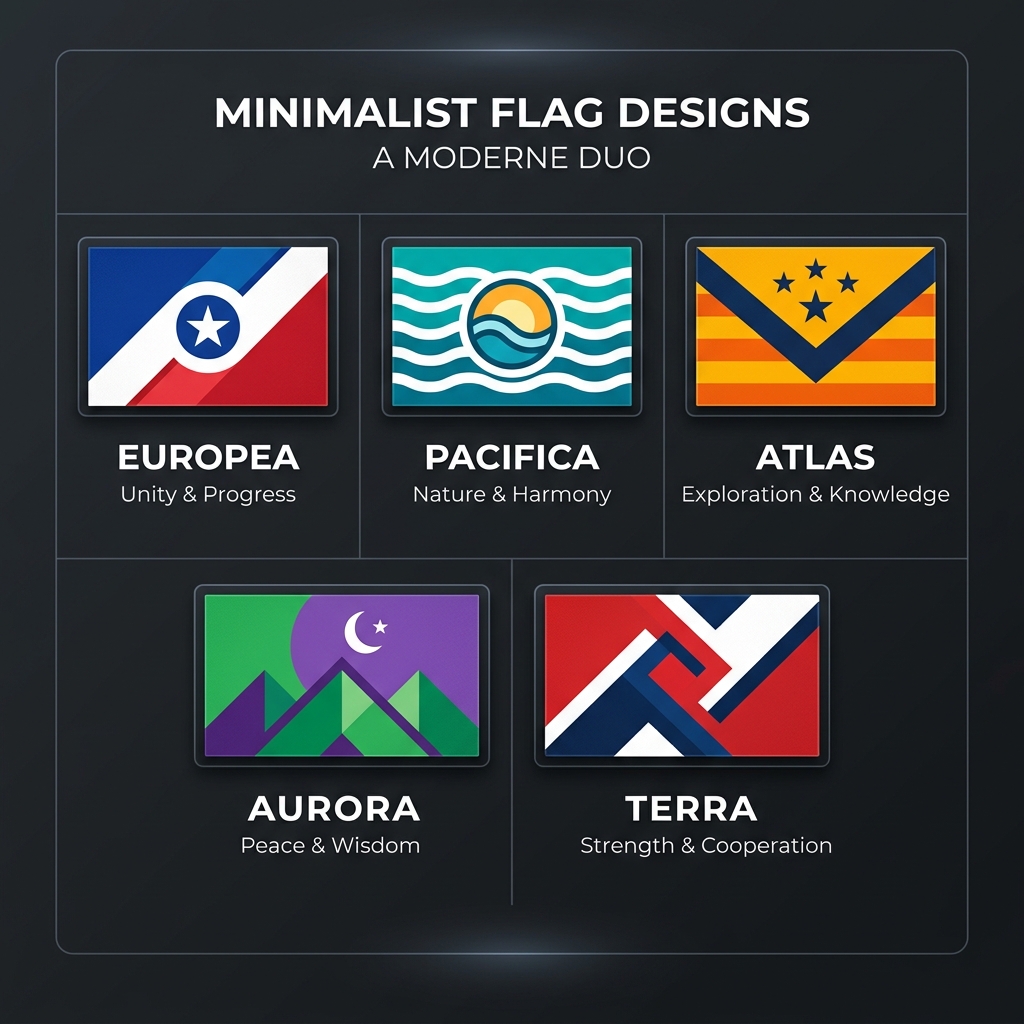
The 5 Rules of Flag Design (Vexillology Explained)
What are the rules of flag design?
The five basic rules of flag design, established by the North American Vexillological Association (NAVA), are: 1) Keep it simple enough for a child to draw from memory, 2) Use meaningful symbolism, 3) Use 2 to 3 basic colors, 4) Never use lettering or seals, and 5) Be distinctive or be related.
Flag design—formally known as vexillology—is a unique discipline. Unlike graphic design or fine art, flags are typically viewed from a distance, while moving in the wind, and on the reverse side. Therefore, a flag must be instantly recognizable.
Whether you are designing a flag for your local sports team, a fictional world, or a real municipality, following these five principles will ensure your design is effective and iconic.
1. Keep It Simple
The flag should be so simple that a child can draw it from memory.
A flag is usually seen flapping in the wind from high up on a pole. Complex details, intricate shading, or tiny patterns will be entirely lost to the viewer. When designing your own flag, stick to basic geometric shapes: stripes, crosses, circles, and stars.
Good Example: The flag of Japan. A single red circle on a white background. It is impossible to mistake it for anything else, and anyone can draw it. Bad Example: The flag of Venice. It features extremely intricate golden patterns and a detailed winged lion that are impossible to reproduce easily.
2. Use Meaningful Symbolism
The flag's images, colors, or patterns should directly relate to what it symbolizes.
Don't just add a star because it looks cool. Every element should have a clear purpose tied to the identity of the group. If you are representing an island nation, you might use blue for the ocean. If you are representing a community known for its forests, green is a natural choice.
Good Example: The Canadian flag. The maple leaf is a universally recognized symbol of Canada, and the red borders represent the oceans on either side of the country.
3. Use 2 to 3 Basic Colors
Limit the number of colors on the flag to three, which contrast well and come from the standard color set: red, white, blue, green, yellow, and black.
In vexillology, there is a rule known as the "Rule of Tincture," inherited from heraldry. It states that "metals" (yellow and white) should not be placed next to each other, and "colors" (red, blue, green, black) should not be placed next to each other. This ensures maximum contrast.
Too many colors turn a flag into visual noise. If you are using our AI Flag Generator, the AI is trained to naturally restrict color palettes to ensure high contrast.
4. No Lettering or Seals
Never use writing of any kind or an organization's seal.
This is the most frequently broken rule in flag design (especially among US state flags). Words are impossible to read from a distance, and importantly, they appear backward on the reverse side of the physical flag. Seals are designed to be read up-close on paper, not flapping high on a pole.
If you have to write the name of your organization on your flag, your symbolism has failed.
Bad Example: The state flag of Montana. It features a complex seal and the word "MONTANA" written in large text. From 100 feet away, it just looks like a blue blur.
5. Be Distinctive or Be Related
Avoid duplicating other flags, but use similarities to show connections.
If your flag is completely unrelated to any other, ensure it stands out. However, if your group is part of a larger family, sharing design elements is a powerful way to show unity.
Good Example: The Nordic Cross flags. Sweden, Norway, Denmark, Finland, and Iceland all share the same basic off-center cross layout, but use different colors to remain distinct while showing their shared regional heritage.
How to Test Your Flag Design
Before you finalize your design, put it through these three tests:
- The Postcard Test: Shrink your design down to the size of a postage stamp. Can you still tell what it is?
- The Reverse Test: Mirror the image horizontally. Does it still look good? (This is why text fails).
- The Grayscale Test: Remove all the color. Do the shapes still contrast enough to be distinct?
Ready to put these rules into practice? Use our free Custom Flag Maker to build your design from scratch using professional vector assets, or let our AI Generator create a perfectly proportioned layout for you based on your description!
Ready to apply these concepts?
Start designing your own custom flag using our free AI-powered canvas editor.