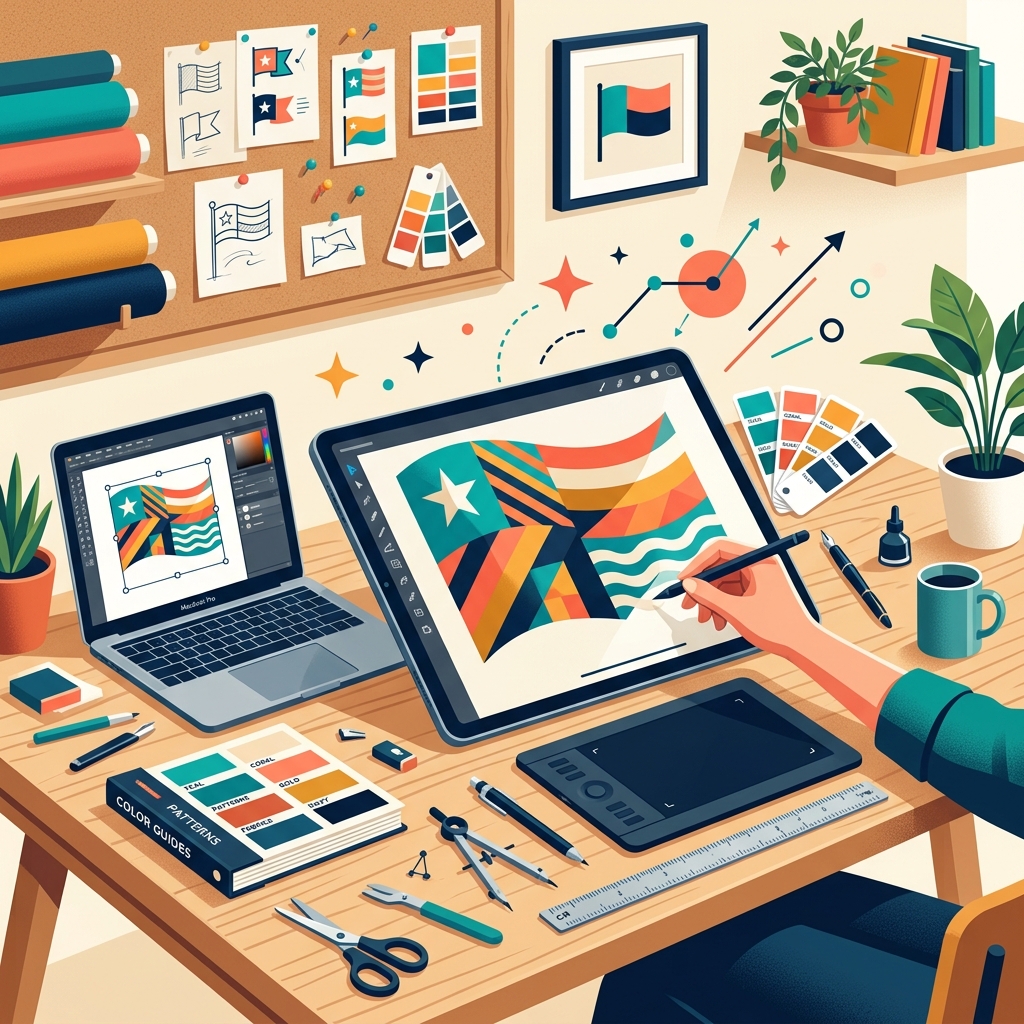
How to Design Your Own Flag: A Step-by-Step Guide
How do you design your own flag?
To design your own flag, follow these 7 steps: 1) Define the purpose and symbolism, 2) Keep the design simple, 3) Choose 2 to 3 high-contrast colors, 4) Select a basic layout like stripes or a cross, 5) Set the correct proportions (usually 2:3), 6) Test the design at a small size, and 7) Use a vector-based flag maker tool to build the final file.
Designing a flag sounds simple until you actually sit down to do it. Most people start with a color idea and a rough sketch — and end up with something cluttered, confusing, or forgettable.
Good flag design is a specific skill. It has rules. And once you understand those rules, the whole process of creating your own flag clicks into place.
This guide covers every step — from blank page to finished design — whether you're creating a flag for a sports team, a gaming clan, a school project, a fictional nation, or a business.
Step 1: Define What the Flag Represents
Before you touch a single color or shape, ask yourself one question: what does this flag actually stand for?
A flag carries meaning at a glance — often from a distance, on a moving piece of cloth. The cleaner the symbolism, the better the flag works. What do you want people to feel when they see it? Pride? Identity? Recognition? That answer shapes every decision that follows.
Think through:
- Who is this flag for?
- What values, history, or identity should it carry?
- Is there a single idea that defines this group or place?
A gaming clan flag has completely different requirements than a company flag or a history class project. Locking down the purpose upfront keeps you from designing something that looks fine but means nothing to anyone.
Step 2: Learn the Rules Before You Break Them
There are five widely accepted rules in vexillology — the study and design of flags — that separate flags that work from ones that don't. These aren't opinions. They come from centuries of observing what holds up at a distance, on a pole, in motion, and at small sizes.
Keep it simple. Can a child sketch it from memory after seeing it once? If the answer is no, the design is too complex. Flags don't get close-up viewing time — they have to land fast.
Use meaningful symbolism. Every element — color, shape, emblem — should connect to what the flag represents. Decoration without meaning weakens the whole thing.
Stick to two or three colors. More than three creates visual noise. The colors you choose also need to contrast strongly against each other — a dark symbol on a dark background disappears the moment you're more than ten feet away.
No text or seals. Writing is illegible at distance and reads backwards on the reverse side. If your symbolism needs a label to explain it, the symbolism has already failed.
Be distinctive, not random. A flag can share design language with related groups — the Nordic cross appears on the flags of Sweden, Norway, Denmark, Finland, and Iceland — and still be unique. What it can't do is blend into the crowd entirely.
Want the full breakdown of each rule with examples? See our flag design rules guide.
Step 3: Choose Your Colors
Color is the first thing anyone notices about a flag — before a shape registers, before a symbol makes sense, the colors have already made an impression. So which colors actually work on flags?
The standard set is: Red, Blue, Green, Black, Yellow (Gold), and White. These six have centuries of established meaning and contrast predictably against each other.
A few things that trip people up here:
- Never place a dark color directly against another dark color. Red on navy disappears. Black on green disappears.
- White and yellow are separators — they sit between two dark colors to maintain contrast.
- Two colors is often enough. Three is the comfortable limit. Four is almost always one too many.
Here's how color meaning tends to map, though associations vary by culture and context:
| Color | Common associations | |---|---| | Red | Courage, sacrifice, energy | | Blue | Freedom, loyalty, water, sky | | Green | Land, nature, growth | | Black | Strength, heritage, determination | | Yellow/Gold | Wealth, sun, optimism | | White | Peace, purity, unity |
Are you picking colors because they look good together, or because they mean something? If it's only the first reason, go back to Step 1.
Step 4: Pick Your Symbols and Layout
Most flags use one of four core layouts. Which one fits depends on the identity you're trying to communicate.
- Divided field — the flag splits into sections (halves, thirds, quarters) using solid color blocks. Clean, bold, works at any size.
- Horizontal or vertical stripes — the most common layout worldwide. Simple and recognizable.
- Cross or diagonal — used across national and regional flags. The diagonal (called a saltire) adds energy; the straight cross feels stable.
- Central emblem — a single symbol on a solid or striped background. Works well when the symbol is simple enough to read small.
The strongest flags are usually the simplest ones. Japan's flag is a red circle on white. Switzerland's is a white cross on red. Both are instantly recognizable because there's nothing unnecessary in the frame.
For symbols, think about what actually represents the identity behind the flag — not what looks cool in isolation. Animals, celestial objects (stars, sun, moon), geometric shapes, and plant imagery translate well across sizes and distances. Anything too detailed — a realistic portrait, a fine crest, an intricate logo — will dissolve into noise when the flag is small or moving.
Step 5: Get the Proportions Right
Here's something most first-time flag designers skip entirely: proportions. Does the aspect ratio of your canvas match how the flag will actually be used?
Standard ratios are:
- 2:3 — used by most national flags worldwide
- 1:2 — common in UK-influenced flags
- 3:5 — the United States flag
- 4:7 — Australia and New Zealand
If you're designing for a Discord server, a game asset, or a profile banner, the ratio may be completely different. Design on the wrong canvas and then stretch it — and your layout will look wrong even if the individual elements are fine.
One more thing: the canton. That's the top-left corner of the flag — the area closest to the pole, the first thing that catches the eye as a flag unfurls. If you have a key symbol, does it anchor well in or near that corner? It doesn't have to sit there, but it's worth thinking about.
Step 6: Test Before You Finalize
You've got a design. Before you call it done — does it actually hold up?
The squint test. Half-close your eyes and look at the flag. Can you still read it? If the design depends on fine detail being visible, it's too complex.
The small size test. Shrink the design to roughly one inch wide. Flags appear tiny in a lot of contexts — app icons, chat profiles, scoreboard graphics. Is it still recognizable?
The reverse test. Look at the design mirrored horizontally. Physical flags show both sides, so anything asymmetric — most emblems, any text — will read backwards from one side. Does that matter for how you're using this flag?
The grayscale test. Strip out the color. Does the design still have enough contrast to read clearly? If it goes flat, your color choices aren't doing the work you think they are.
Step 7: Build It in the Right Tool
You have the concept. Now you need to build it — and the tool you use matters more than most people expect.
The most common problems at this stage:
- Designing in a raster tool (Photoshop, MS Paint, Canva) means the file pixelates when scaled up. Flags need vector files — SVG or PDF — to stay sharp at any size.
- Starting with the wrong canvas proportions means you'll stretch or crop the design to fit later.
- Eyeballing colors instead of using exact hex values means inconsistent output across different uses.
FlagCreators is built specifically for this. Start from a blank canvas already set to correct flag proportions. Drag in shapes, symbols, and color blocks from a library of 150+ assets. Export as PNG free, or grab SVG and PDF vector files on the paid plans from $2.99/week.
Already know what you want but don't want to build it piece by piece? The AI flag generator takes a plain-English description and produces a fully editable design — proportions, colors, and layout set correctly from the start.
Mistakes That Ruin Otherwise Good Flag Designs
Cramming in too much. Every time you add an element, ask whether removing it would lose meaning. If the flag still works without it, cut it.
Putting text on the flag. Colorado's state flag has no text. Vermont's has the state name printed across the bottom. One is iconic and reproduced everywhere. The other looks like a letterhead. The rule exists for a reason.
Designing only for a screen. A flag that looks great as a desktop wallpaper might be unreadable on a 32x32 favicon, a phone notification icon, or a profile picture thumbnail. Test it small.
Iterating until it's unrecognizable. The best flag designs tend to come from early drafts, not the fifteenth revision. If each edit is making the design more complicated rather than cleaner, that's a sign to start fresh with fewer elements.
Frequently Asked Questions
How long does it take to design a flag? The concept stage — figuring out colors, symbols, and layout — can take anywhere from 20 minutes to a few hours depending on how clear the brief is. Actually building the design in a proper tool takes most people under 30 minutes once they know what they want. If you use an AI flag generator, the initial draft is ready in seconds.
Do I need design experience to create a flag? No. Flag design actually rewards simplicity over technical skill. The best flags — Japan, Switzerland, Jamaica — are ones anyone could sketch. The challenge is having a clear idea, not being able to execute complex artwork.
What file format should a flag be in? SVG or PDF for anything that needs to scale — presentations, digital branding, large displays. PNG works fine for web use, social profiles, and game assets where you know the display size in advance. Avoid JPG for flags — the compression creates visible artifacts around color edges.
Can I use my flag design commercially? That depends on the tool you use to create it. On FlagCreators, the free Starter plan covers personal use. The Weekly and Monthly paid plans include a full commercial use license — meaning you can use the design for business branding, merchandise, client projects, and any commercial application.
How many colors should a flag have? Two or three. One is fine if the design is strong enough. Four or more is almost always too many — it makes the flag harder to read at a distance and harder to reproduce consistently.
What makes a bad flag? Text, too many colors, excessive detail, no clear symbolism, and designs that only work at large sizes. The flags most vexillologists point to as failures share the same problems: they look like seals or logos that were slapped onto a rectangle rather than designed as flags from the start.
What's the best aspect ratio for a custom flag? 2:3 is the safest default — it's what most national flags use and what most flag display contexts expect. If you're designing for a specific digital use (a banner, a game asset, a social profile), match the ratio to that platform's requirements.
Start with purpose. Pick colors that mean something. Keep the layout clean. Test it small. Then build it in a tool that handles the technical side.
If you're ready to build, open the FlagCreators editor — no account needed to start.
Ready to apply these concepts?
Start designing your own custom flag using our free AI-powered canvas editor.